
In a recent article, 5 Rebranding Wins, we discussed how rebranding campaigns are initiated to improve customer perception or launch new products and services. Often they are simply to refresh a brand that’s feeling out-of-date or disconnected from its audience base. The results can be tremendous, but sometimes things go wrong. Here are a few examples of when brands tried and failed with rebranding campaigns.
Tropicana
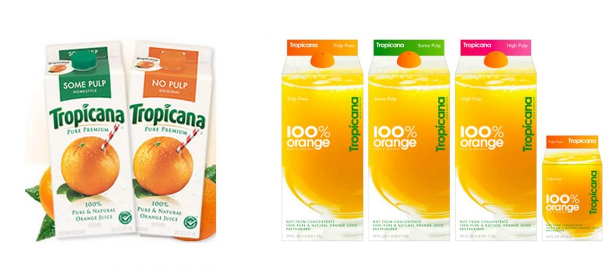
In 2009, Tropicana (a Pepsico brand) decided to change the packaging of their orange juice cartons. Customers were unable to recognize the product in grocery stores. This resulted in a drastic 20% drop in sales, roughly $33 million. Tropicana had to ditch the new packaging and go back to the old look within 2 months. When customers have come to recognize a product by its distinct packaging, making too drastic of changes can shake both recognition and confidence with negative outcomes. For well-established brands, successful visual rebrands are typically more subtle.
Netflix
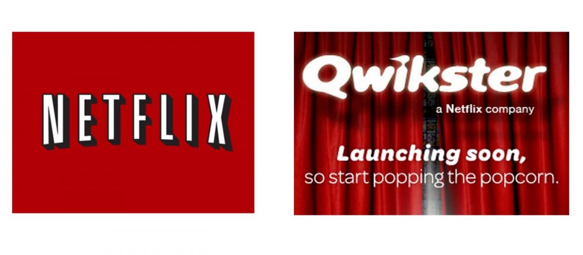
Not all rebrand disasters come from changing the visual image of a company. In 2011, the CEO of Netflix announced that it would be splitting into two separate businesses. The mailed DVD service would remain as Netflix and the online streaming service would become Qwikster. Not understanding the reasoning behind the change, customers were outraged. The company soon admitted that they “underestimated the appeal of a single website and single service,” and they scrapped the idea altogether.
Mastercard
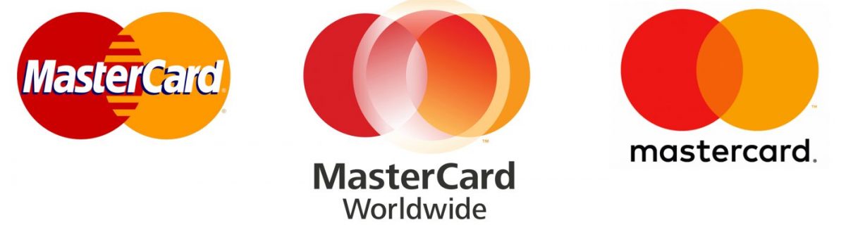
Mastercard, known for operating the world’s fastest payment processing network, has had the same iconic logo for over 50 years. Consumers can easily recognize the red and yellow circles even without the Mastercard name attached. But for some reason, in 2006 the brand decided to move away from the interlocking double-circle design and added an additional transparent circle on top that had a lens-flare appearance. It was placed off-center, and the addition did not bode well with consumers. The idea was quickly scrapped.
Dr. Pepper Ten
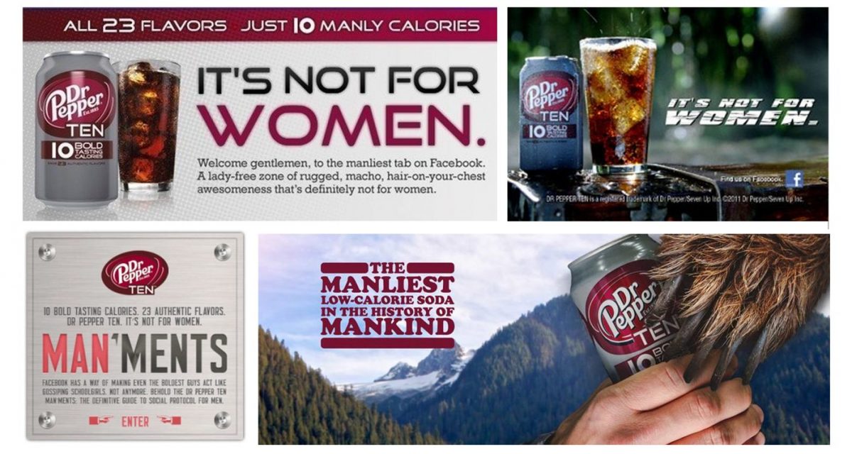
Marketing campaign messages are just as important to a brand’s image as their logo and product packaging. In 2011, Dr. Pepper created Ten, a new 10-calorie version of their diet soda with a tagline proclaiming: “It’s not for women.” The beverage was marketed to men, but the language was perceived to be offensive to women. This type of advertisement alienated half of its viewers, so the product and it’s less-than-courteous marketing messages were soon discontinued.
Syfy
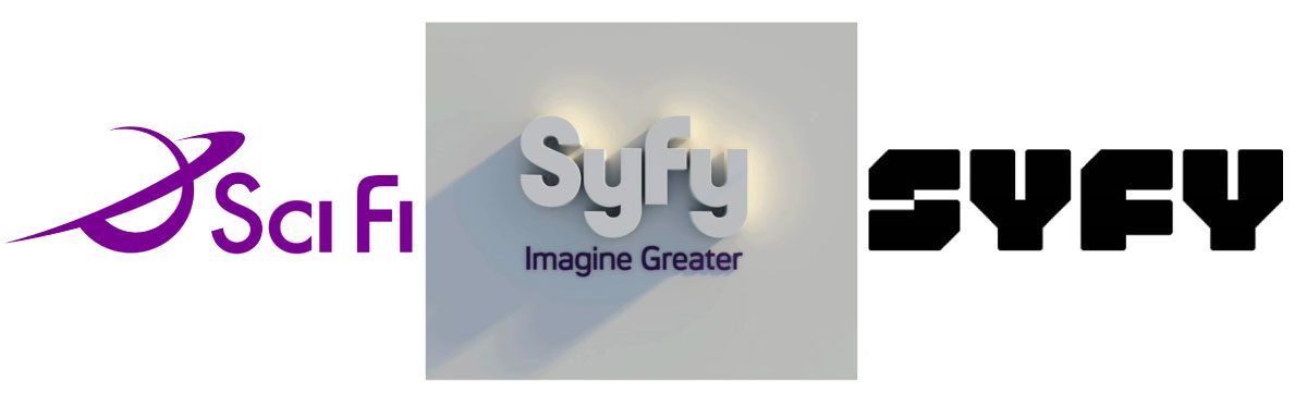
Wanting to separate themselves from similarly named companies, the Sci Fi Channel decided to rebrand with a new name. Unfortunately, it seems as though no one checked into its pop culture meaning before moving ahead with the official change (or maybe no one though the public would notice). Syfy happens to be a slang term for syphilis. The new name is phonetically identical, but the connotations are not. The original spelling gaff aside, the move from a curved font to an angular one better suits a brand that serves up alien adventures and apocalyptic thrillers.
If your brand isn’t faring as well in the market as you’d like, or you’ve outgrown a dated concept, contact our team for professional help with assessing market fit and avoiding branding fails.
Just curious? Start with our free 17-Point Brand Inspection to evaluate your brand’s effectiveness and relevance in the market.