A logo is possibly the most pivotal element of business marketing. It can be the sole reason a buyer chooses you over a competitor or it can desperately hurt your marketing efforts. It conveys invaluable information about your company such as its direction, principles, and philosophy. A well designed logo should evoke a positive emotional response from your buyers.
Imagine this scenario: Picture yourself driving to work early in the morning. You’re sleepy, a little grouchy and in desperate need of coffee. You come to an intersection with coffee shops on opposite sides of the road. You see two signs: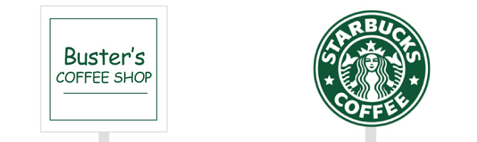 Which way did you turn? Most of us would turn into Starbucks. A large part of that (often unconscious) decision is because their logo is designed to evoke a positive emotional response. Their logo is also part of a trusted brand. You know what your experience will be, and if you’re a Starbucks customer, you’re willing to pay for it. The coffee shop name on the left is clear, but indistinct and lacks emotive triggers that would increase buy-in. In this article, we’ll look at 4 key attributes for a positive logo design.
1. Focus on Your Audience
Focusing your logo design toward your audience instead of yourself, can be one of the hardest things for business owners to embrace. After all… it’s “your baby” right? Well, not quite. Not in today’s business climate where moves happen fast and the consumer drives your reputation and your bottom line. Without customers, your baby will starve. So ask yourself, “What will speak to my most profitable customer?”
![]()
In the case of Century Credit, their target audience is people who need help qualifying or prequalifying for an auto loan. The company is based in Jacksonville, North Carolina, where as of 2012 the median age is 23.1 and the population is 58.1% male. 2010 census data reports the median age at 22.9. That’s a young city. If auto financing is the objective and the population is young and predominately male, it makes sense to use a visual reference that appeals to the demographics and psychographics of the community. A station wagon would not be ideal. It’s also important to communicate trust and integrity for a reputable financial group.
If you don’t possess a clear determination of who your target audience is, STOP here! Determine that before proceeding any further with a logo design. You can only speak to a person effectively through your marketing if you know who they are and what they want.
2. Focus on a Single Primary Emotion
One common mistake in logo design, is trying to do too much at once. A logo isn’t there to tell your entire company history or paint out the 17 services you offer. An effective logo will focus on one desired emotion. Ask yourself this question: “How do I want my customers to feel when they see my brand?” You might want them to feel safe (trust), happy, empowered, or inspired. There are a variety of positive sentiments, but if you establish a single primary emotion to associate with your logo, it will be much easier to target the rest of your marketing efforts. Again, knowing what your customer wants is pivotal.
3. You Might Incorporate a Symbol
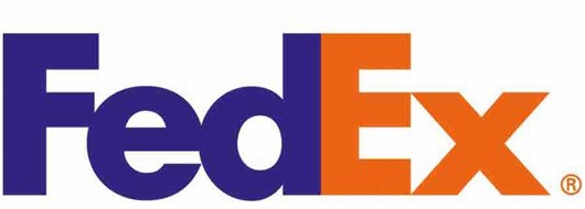
Symbols can be an effective way to convey motion, meaning or emotion. The FedEx logo seamlessly incorporates a white arrow within the typography (between the E and x), suggesting forward movement. Subtle, but effective.
![]()
Symbols can also be more obvious in their approach to evoke emotions. For instance, Amazon’s upward curved arrow points from the “a” to the “z” within the name and also looks like a smile. This helps illustrate the point that their customers can purchase almost anything on their site and alludes to a satisfying buyer experience.
4. Consciously Select Design Elements
You can come up with a great concept for your logo, but if you fail to properly address design elements, it could end up sending mixed signals. Choosing colors, fonts, angles, and other elements wisely contribute to the composition and message of your logo. Each element should be deliberately chosen to evoke the positive emotion your brand is after. Keep both the company and the audience in mind as you make selections.
For example, sharp, thin lines are great for communicating innovation and trust for an IT company. However, sharply angled lines are too hard and edgy for a toy store. The Toys-R-Us logo masterfully uses a playful font with bright colors to communicate with its audience. But just imagine how ridiculous it would be to use that same approach for an accounting firm! The fictitious example of “Smith Brother’s Accounting” (image below) completely lacks credibility. We trust Toys-R-Us to provide safe toys for children everyday, but would not trust that accounting firm. 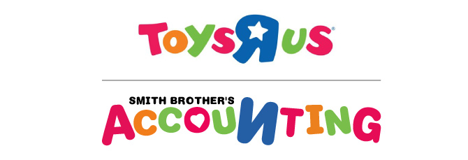
Colors are powerful in evoking emotional responses. Massive studies have been conducted on the psychology of color. Red is a power color… but it also can imply risk, danger or negative finance balances (aka being “in the red”). Therefore, a financial planner would not typically want to use red in his branding. Blues can be cool and refreshing, evoke trust or high energy, depending on the shade. Green commonly is associated with growth. Yellow is often considered a “happy” color, full of energy and warmth – but if you get close to “caution sign orange” you’d better be selling caution signs or your audience may be slow to trust you.
The design elements you include play a very important role in conveying emotion, so be sure to take these into consideration when developing your logo and other brand-defining elements and materials. Always consider your customer’s response. If you don’t already know what your customers wants and needs are, take time to research them. Ask existing customers, research online reports and trends, look at what others who are successful in your field are using for colors, tone and visuals. Taking the time to get the data and keep your design focused on your customer will reap rewards for years to come.
Additional Resources
Need help identifying your best customer? Contact us for help or read more here.
Want more on color psychology? Here’s an Infographic on the Psychology of Color.
Samples of Clever Use of Symbols in Logos: 20 Clever Logos with Hidden Symbols.