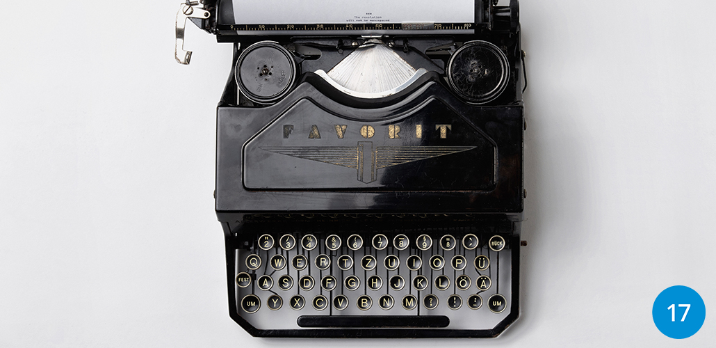
Tall and dark? Curvy? Slender? Everyone has a favorite…
I like mine thin, but STRONG. Andrew favors boldness. Cindy likes ‘em a little more go with the flow. Of course I’m not talking about people here. I’m talking about typography! And in your marketing, the subconscious emotions that font choices create for consumers. Just as you are drawn to some people, font preferences can be strong and can have the ability to influence emotions. Specifically, they can help define what your clients and prospective clients think about your brand.
When choosing color – red, yellow, and orange tones give the feeling of heat, excitement or anger. Blues, purples, and greens are cool and trustworthy. Font styles create emotional responses as well. Let’s look at 3 main font styles and the emotional connection often made with each of them.
A Trusted Font
Serif fonts are fonts with the small lines at the end of each stroke. These include fonts such as Times, Georgia, and Courier. Those fonts are very traditional as they are based on original fonts and forms from the printing press. They tend to convey a sense of tradition and classicism. Bold versions of serif fonts convey strength and authority. A serif font infers that you take yourself seriously, and want to portray yourself as professional as possible. Government institutions, banks, and lawyers tend to favor serif fonts for these reasons.
A Forward Thinking Font
Sans Serif fonts are fonts without the small lines at the end of each stroke. Some of the most popular sans serif fonts are Helvetica, Arial, and Verdana. These fonts are modern and fresh, dependable and friendly. Their straight lines and geometric shapes convey a sense of forward thinking, and being on the cutting edge. The most famous brands using sans serif fonts include Apple, IKEA, and Google.
A Mixed Bag of Fonts
The final style we ‘ll look at is Decorative fonts. This includes script fonts, handwritten fonts, and image-like fonts. Some of the most popular are Scriptina, Brush Script, and Stencil. The emotions evoked by decorative fonts is quite broad. A more formal script font feels elegant and may imply formality, exclusivity or expense. A handwritten font is fun and can feel youthful or childish. Very creative decorative fonts such as BumbleBee, which is a script type font made of dashed lines, are perfect for themed events or offerings. Be cautious in the use thought, as they can be difficult to read and may strike a tone that is immature if used incorrectly.
Your Type?
So before you choose a font for a logo or product, remember to think beyond the initial visual appeal of the font. Often a combination of two different fonts works well and creates balance both in the visual design and emotions of a graphic. A general rule of thumb is two fonts for a logo and three fonts for a brochure or other branding materials. Everyone has a preference when it comes to fonts, the trick is to pick the one that best represents you, your company and your values to your customers and fans.
What’s your Type?


