Creating a Call-to-Action (CTA) that actually works isn’t always easy. Visitors to your site are looking for something specific and you’ve got a short time to inspire them to take action. This seemingly small component is actually one of the most important parts of your marketing campaign. But historically, both businesses and marketers have been guilty of giving them too little attention or forgetting them altogether.
That’s pretty remarkable, since over 90% of visitors who read your headline also read your CTA copy. (Unbounce) And that CTA copy is critical. For example, ContentVerve saw a 90% increase in click-through rate by changing to first-person phrasing: “Start my free 30 day trial” vs. “Start your free 30 day trial.” Getting it right makes a huge difference.
Crafting a compelling call to action that inspires your visitor, but doesn’t come off as “pushy” is a balancing act, but here are some tips to help you create strong CTAs that will have enough urgency and enough value to increase conversions.
1. Keep it brief
Your CTA can be a single word, a short phrase or a brief description. Don’t clutter your message or make it sound complicated. Simple is good. And less is more. Think about the actions that you take most online: “Add to cart,” “Favorite” or “Share”… Simple, direct calls to action are the most effective. Don’t ask your prospects to read paragraphs if you can encapsulate the value of your message and offer in a phrase or two.
2. Make it Visually Clear
Use words, images and shapes that are easily understood and don’t require analysis. Use phrases like “Download” or “Subscribe” with shapes and colors that make the desired action clear and remove any “what is this?” doubts for your prospects. When using images, make them clear, quality images that support your message. CreateDebate changed their CTAs to look like buttons and found it created a 45% boost in clicks. Visually clear = intuitive and that makes happy users.
Netflix does a great jov of making it brief and visually clear. You see what you’re going to get and the big, red button is hard to miss… “Join free for a month.”
3. Be a Little Urgent, but not Pushy
If it’s short, and visually clear you’re already on your way to an easy-to-click CTA. Now consider a tone that implies a bit of urgency. “Buy NOW!” tends to come off as a pushy salesman, but “start saving today” is more helpful and value-oriented for your prospects. You want to inspire action at this moment, but doing so in a helpful way makes the transaction feel more genuine and trusted.
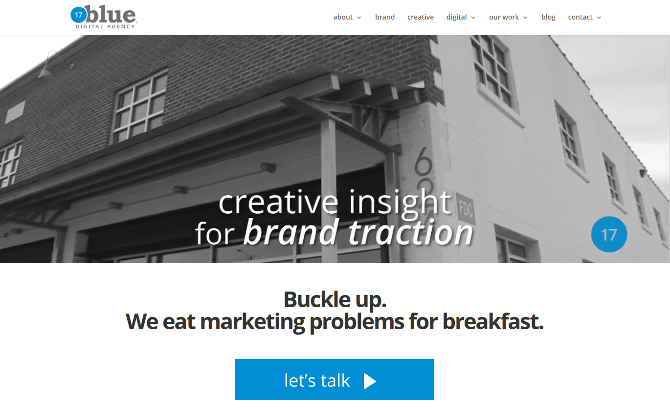
This CTA comes from our own home page. We’re not big on “buy now” messaging, but “let’s talk” suits us fine, and the blue button matches our logo and name.
4. Don’t Hide the CTA
Visibility is obvious, but critical. Your prospect needs to see the call-to-action if you want them to be able to take the action. Creating a clean landing page or removing clutter around the CTA will help it be visible. Sometimes it’s helpful to place a CTA in the top portion of a page (“above the fold”), but an experiment from ConvertVerve found that placing it below the fold near strong supporting information resulted in a 304 percent conversion rate increase. Clearly, your CTA must be visible, but it should also be in a place that makes sense for the visitor’s decision to take action.
5. Just One Click
Don’t ask your prospect to click more than once to get to what you’ve offered them. Whenever possible, use a single step sign-up, download or other delivery. Multiple clicks reduce conversions dramatically due to frustration and mistrust. Make the process as short and painless as possible.
Heads up… this is a call to action:
6. Not One-and-Done
If your CTA is well-crafted and offers value to your prospects and customers, it’s worth using. Place your CTAs in more than one place. Utilize them on landing pages, in blog articles, emails and social shares. And use them again later. Just like you wouldn’t expect one ad in January to drive sales all year, your CTA will need to be re-shared and given it’s second and third moments in the spotlight.
Well crafted CTAs are clear, easy to understand and easy for the visitor to complete. Check your CTAs and make changes where there are too many words or unclear messaging. Track your conversion rates and see how much improvement you can make in creating calls to action that really work!
